Geometrika is my first typeface, created for the Morisawa Type Design Competition 2014.
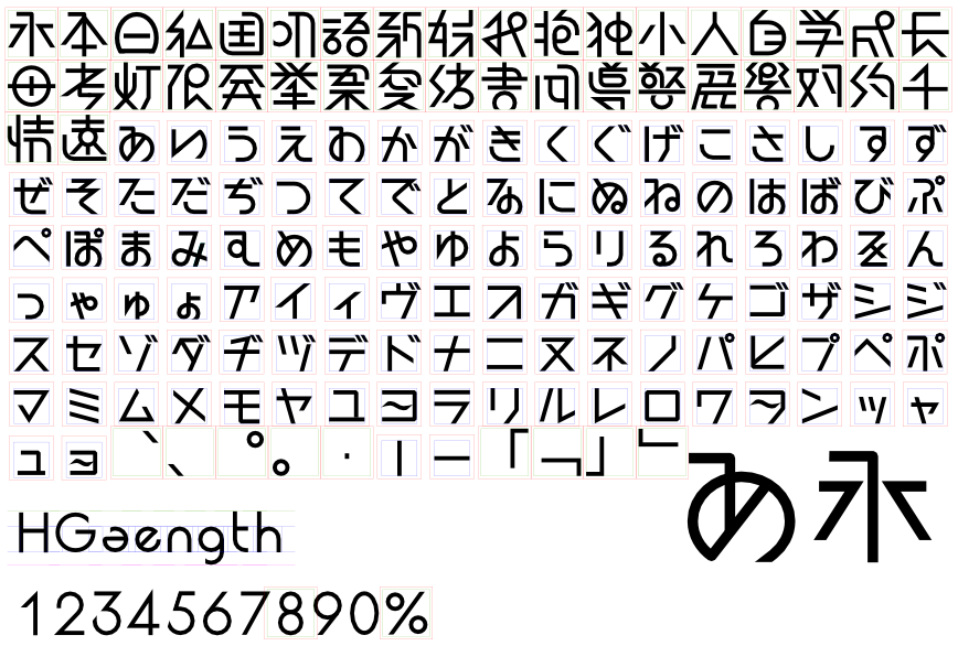
Inspired by Paul Renner's Futura typeface and Nihei Tsutomu's futuristic artworks, Geometrika is an experimental geometric sans-serif (perhaps the first in East Asian typography?) Each character was reconstructed with simple geometric shapes - circles, triangles, parallel lines - and the form was distilled to the edge of legibility limits. Apart from the futuristic and minimalistic design, deep down there's a vision of prototyping what East Asian scripts will look like in the 22nd century (seriously).
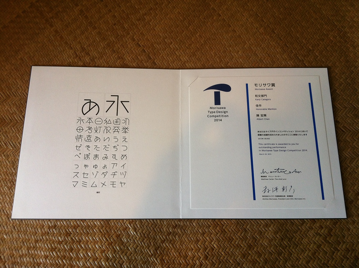
Geometrika won an Honorable Mention in the Morisawa competition, the only non-Japanese winner in the Kanji category. There is plan to make it a full-blown usable font, albeit the final design would be quite different.
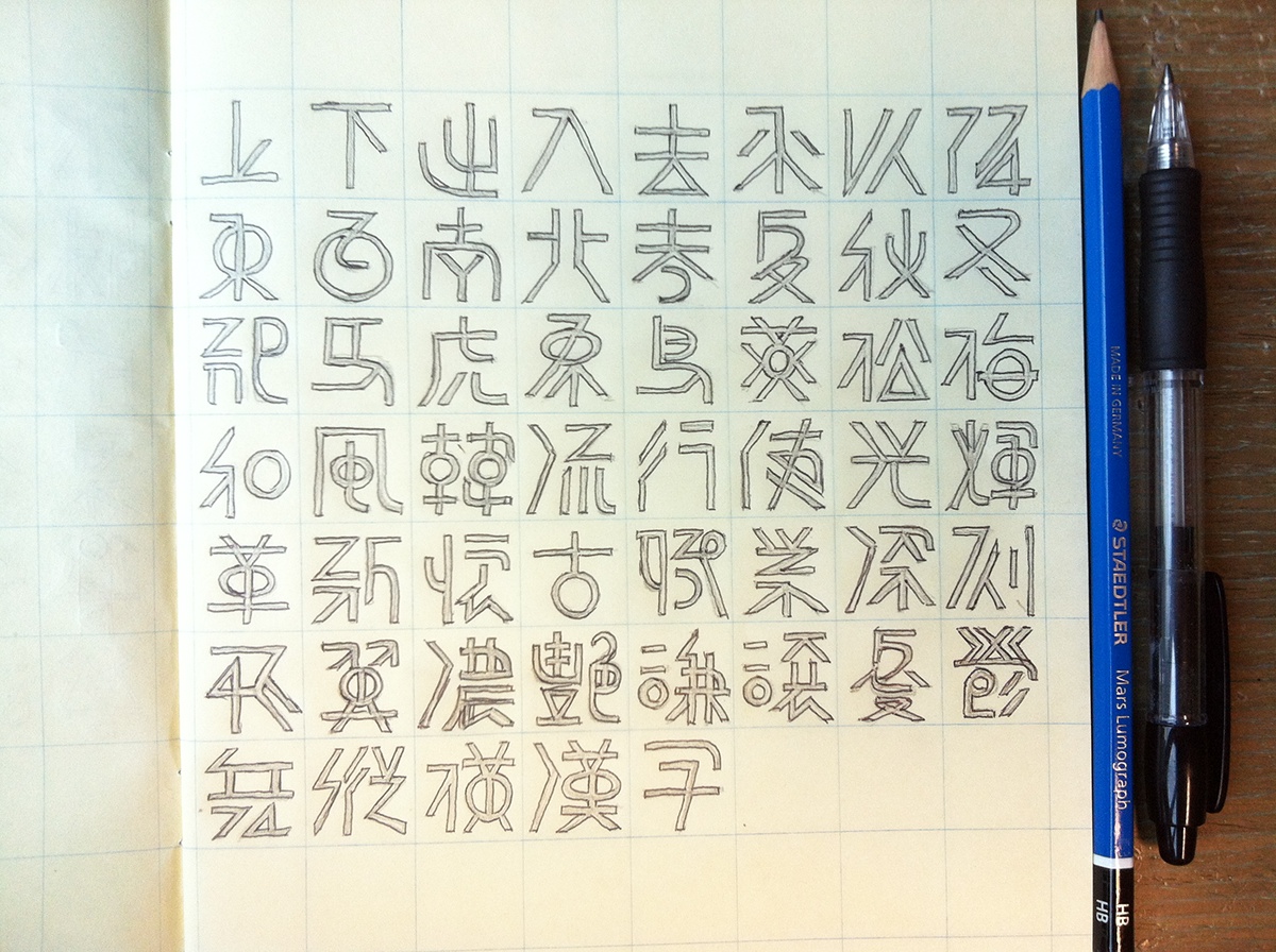


First draft bold version (not used)
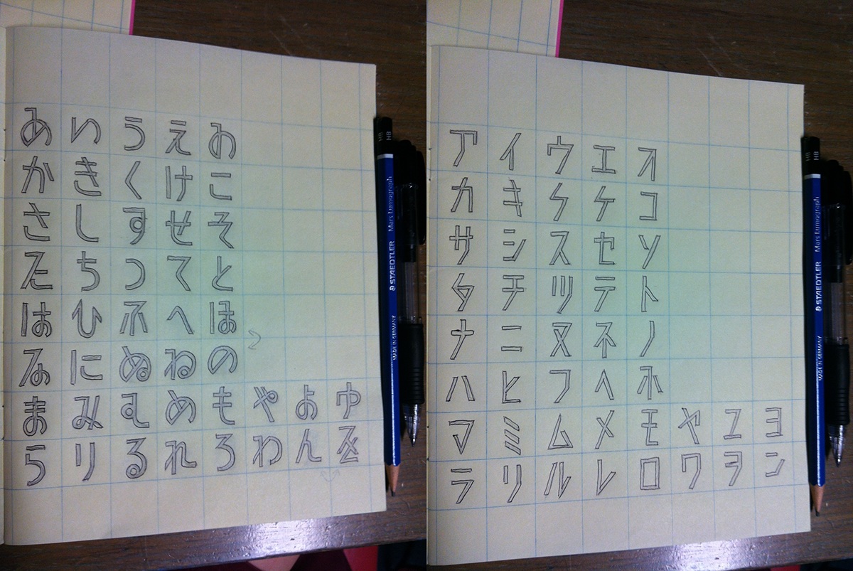
Final light-weight version with a more futuristic touch


The "みや" ligature is my favorite construction.
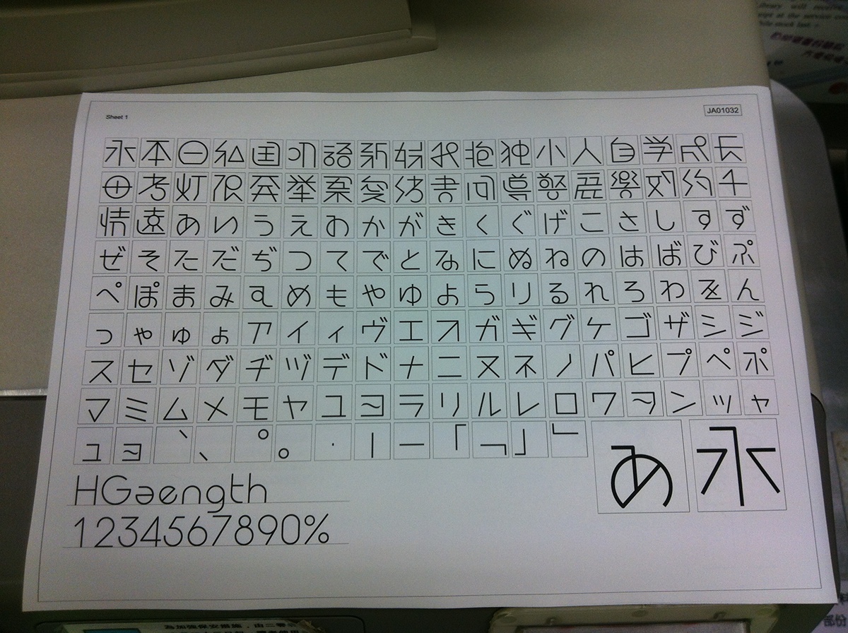
At the moment I got this printout for final checking, I start to understand and appreciate the incredible patience needed for type designers to produce typefaces we use every day. Each typeface is a masterpiece of craftsmanship.
Trophy, certificate and showcase book from Morisawa. There's always such kind of elegance in Japanese designs.


The funny feeling to see your work printed on a book. It's also great to receive comments from the admirable judges, including MUJI art director Kenya Hara! His comment reads:
"I sense an aesthetic appeal in the manner in which the characters are captured. Some characters are illegible, but I feel that the challenge of how far a character can be deconstructed and yet remain legible is interesting."
